
Bio
15,779
Karma
839
Comments
Male
Gender
43
Age
Mediterranean
Location
Engineer
Occupation
• FLAGS •
In the earlier article, I have mentioned heraldry as an interesting source of my inspiration for colours and palettes. However, I have done injustice by forgetting to mention the flags. Vexillology (the study of flags) has precisely analyzed the various flag colours and their meanings through the centuries, and much of its knowledge can prove very useful when trying to produce a very specific effect with a colour, palette or pattern. The basics are quite simple (e.g. blue almost always represents the sky or the sea, red represents blood, yellow the Sun, etc.), but almost every well-documented flag tells an interesting tale of its colours, and why are they exactly the way they are. Often, on more complicated designs, the colours acquire some new meanings. Of course, there are some limitations, such as very rare colours (pink or violet), and most of the colours being, for practical reasons, very lively and bright. But regardless, there's a lot to learn. Two thumbs up for vexillology!
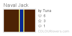
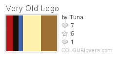
• LEGO •
As a child I've had endless fun with Lego bricks (and I admit, I still have nowadays). Modern bricks can be found in a plethora of colours, often adapted to the theme, but I will always admire the vintage Lego for its chromatic simplicity. Simple bright red, black, white, yellow, blue, grey and that's about it - unless you've found some rare green or brown bricks, or even transparent ones. But that was, in my humble opinion, the essence of Lego - taking something elementary, and building it into something rather complex. Great constructors and designers managed to make some great-looking sets using only those basic colours and the simplest bricks. On the other hand, building a large model with only a limited supply of bricks often gave no choice of colour at all, resulting in very colourful, almost psychedelic constructions. If you've got some spare time and old Lego sets stored in the cellar...
• COLOURS OF... MUSIC? •
As many colourLOVERS have already noticed a long time ago, almost any song could be generally represented by a specific colour that represents its mood. Of course, there will always be individual impressions (which is good!), but the general idea, or at least the general hue, saturation and brightness, should in average remain the same. As a rule of thumb, the music genre relates strongly to the hue, and its mood and depth to saturation and lightness (but the things get complex here). I'm very intrigued by this relation, and one good place to "investigate" it are videos: good music video directors have often used the dominant colours matching the music to make a stronger bond between the picture and the music.

• IMPOSSIBLE COLOURS •
It was quite intriguing to read the article) about impossible colours, i.e. imaginary colours seen by each eye differently, and "mixed" together in the brain to form something completely new, never-before seen. I've tried it, and indeed I've had a perception of a completely new colour, but unnatural and somewhat confusing as it is, I don't think it can be really widely used in the art - except for maybe some quite controversial stuff. The good old "possible" colours are just as fine...
• THANK YOU, FELLOW COLOURLOVERS! •

Trixxie
Trixxie
JMG84
Olga Milukova
Trixxie
zither
Trixxie
Happy Holidays to you!
Trixxie
Trixxie
Thanks for the loves!!
AdvisorAnne
Post a Comment